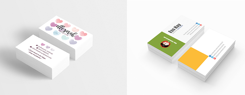
Effective Business cards can be told of who you are. Not only can you create a wonderful first impression all on your own. A simple, unique card is a fantastic way to create a strong impression. It’s also your emergency way to connect. Do not mention the full story about your company. What you should expect it to do is present a professional image people will remember.
The color, wording and texture of our visiting card have a lot to do with its attractiveness and its ability to convey your company image.Keep it simple, do not add an excessive amount of information on the card.Do include the name, designation, company name, address, phone , email and web site addresses.
Confirm the font is well clear.
Decide the idea
If your company is all business, your cards should be too; follow classic designs with minimalist appearance and stylish fonts and colours. If your brand is more creative and innovative, you’ve got liberty to use bold pictures, impressive colours.
Size
The most common card size is 3.5 inches by 2 inches. You can go bigger, your cards are less probably to be unbroken. If you go smaller, you have got a stronger shot, as long as they still slot in a typical card folio.
Orientation
This simply means that which way people view your cards.
Landscape
Landscape format is more traditional and still the most common orientation. it’s simple to read, works well in card holders and can be handled by any printer. However, it’s common, and not as unique as alternative choices.
Portrait
This is a clean and best look that’s become in recent years. It can be printed by any printer. On the down side, it’s hard to read in a card holder.
Color
Use colours that work well together and represent your brand.
Font
Choosing the proper type is important to giving your card the right feel.
- Make sure you use a minimum of 8 point font that the kind is readable.
- Serif fonts tend to give a a lot of classic feel and sans serifs a more modern ambience.
- A designer should embed the fonts in the file, rather than creating outlines of the text.
Front of your card
- The name you want contacts to use
- The organization or business you’re connected to, if any
Designation - Your contact information e-mail and phone number at a minimum, social media profiles and web site unless you actually have no presence at all, and a work address if that seems relevant.
- Your logo
Back of the card
This is where you’ll be able to let your brand shine! Advanced imaging in the kind of original artwork or photography is one of the most effective ways in which to induce a totally unique result, particularly for less traditional businesses, this is also a good place to put a large version of your logo.